made with Laravel
Description
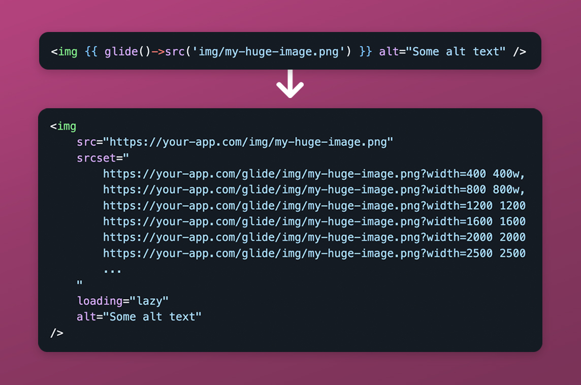
Generate Responsive Images
"Currently, it's almost a requirement to load images on websites in such a way that they are responsive and not unnecessarily big. This means that every image should be scaled down to a variety of sizes, so that browser on smaller screens don't have to download a large image unnecessarily. This technique is accomplished by using srcset and sizes attributes on each
imgtag.However, if you receive a 3000x2000 px image from your client, you don't want to put this into Figma or other tool, generate 5 versions, name them in a sensible way, manually put them in the correct public folder, etc. This is just a tremendous hassle, whereas usually you just want to drop in the original image in your project, refer to it via a src and be done with it.
This package aims to solve this problem in a simple and sensible way."

Social Media Links